There are a lot of mixed attitudes towards so called ‘self help books’, books that aim to take aspects of psychology and its theories and use them to advise and encourage people to look within themselves and find ways to enhance their strengths and understand themselves better to better their mental and physical quality of life. While popularly sold in western countries, some feel that they promise a pipe dream and are less effective than they claim to be in improving people’s lives. It is therefore important that publishers design covers for such books in a way that project relatability and informality or friendliness as opposed to cold, scientific professionalism in order to attract the average person.
The two following books do just that in quite different ways:
Notes on A Nervous Planet

Notes on A Nervous Planet by Matt Haig functions as a book of simplistic, short ‘how to’ chapters that aim to help the reader learn how to live in a modern technologically interconnected world without compromising their wellbeing and mental health. The 2019 paperback cover design reflects that well. It features a plain black background behind white text and a gradient multicoloured wavy line travelling from the top righthand corner to the bottom left where it continues off page.
The text itself is left aligned and almost fully capitalised, not including the reviews and the author’s name. The straight, thin lines of the title lack any serifs and make for a simple, easy to read layout that effectively embodies the contents of the book and effectively ensures it doesn’t overwhelm the reader/browser - just as the book itself aims to help the reader avoid being overwhelmed in their life. In fact the only gimmick in the text is the filling of the reviewer’s names with different colours, serving to add a pop of colour to catch a potential buyer’s eye, and a white and grey image of the earth used to represent the ‘O’ in ‘nervous’.
The lack of colour in the image not only allows it to blend well with the rest of the text but represents the state of society currently that the book highlights; devoid of colour, anxious, stressed and unable to look up from technology as a branch to work, news and a connectivity we feel we can only get from 24/7 technological access. The multicoloured line that floats across the page, wrapping around the earth may then be interpreted as a lifeline of sorts; potentially symbolising the book itself as an opportunity to learn how to disconnect from connectivity and rediscover colour. The combination of that and the uncomplicated typeface provides an overall relaxed cover design that instantly conveys the purpose of the book to potential readers.
Embrace Your Weird

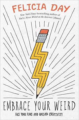
Embrace Your Weird by Felicia Day aims to help readers ‘vanquish enemies of creativity - anxiety, fear, procrastination, perfectionism, criticism and jealousy’. Where Notes on a Nervous Planet’s cover design is ordered and calming, Embrace Your Weird’s cover is busy and exciting. However it is in no way overwhelming; instead the lightning bolt shaped pencil pointing fiercely to the book’s title, accentuated by black lines indicating waves of energy emanating from the point of the pencil provide a motivational air of power and a can-do attitude.
The title of the book is printed in a shaky, thin black font with each letter reaching different ascender and baselines, creating an overall handwritten effect matching the creativity tones of the book. However, the text is fully capitalised, ensuring it retains a strong, positive feel despite the shakiness of the lines. It therefore is able to provide just as much an air of confidence as Notes on a Nervous Planet, simply in a more exuberant way.
The cover is headed by Day’s name in a similarly handwritten style font, only the letters are thicker and the text is red. These minor changes distinguish the text from the title, while the upwards curve in which Day’s name is placed is reminiscent of a red sunrise, indicating the beginning of something (perhaps the reader’s journey in overcoming their barriers to creativity). Under other circumstances, the bold design of this text would draw the reader or browser’s eye before any other part of the cover, but not in this case. The jagged lines and yellow colouring of the pencil demands immediate attention, while the direction in which it points makes the title of the book the next thing the eye focuses on. Then the eyes are finally drawn upwards to the author’s name. Much like with Haig’s book, the focus is not on the author but the title of the book which embodies the book’s themes best.
In conclusion then, while both books cover anxiety and barriers to potential, their strategies are vastly different and this is clear by the design of their front covers.
Find the Books on Goodreads:
Notes on a Nervous Planet - https://www.goodreads.com/book/show/40875705-notes-on-a-nervous-planet
Embrace Your Weird: Face your Fears and Unleash Creativity - https://www.goodreads.com/en/book/show/43822665
