Spirituality literature covers a wide range of subjects, from religion to crystal work to astrology. However, given the fact that spiritualities are based largely on a set of beliefs rather than proven facts, such subjects are not considered science. This means that while geology (the study of rocks) is considered a science, crystal healing (the practise of using crystal ‘chakra’ or energy to heal or channel certain energies) is not. Similarly, astronomy (the study of the planets and stars) is considered a science but astrology (the practice of using planetary movements to determine and predict outcomes and behaviours) is considered to be more of a spiritual study. This naturally means that such topics are written as entirely different genres, and so the designs of their book covers tend to differ quite a lot.
Philip’s Guide to Stars and Planets

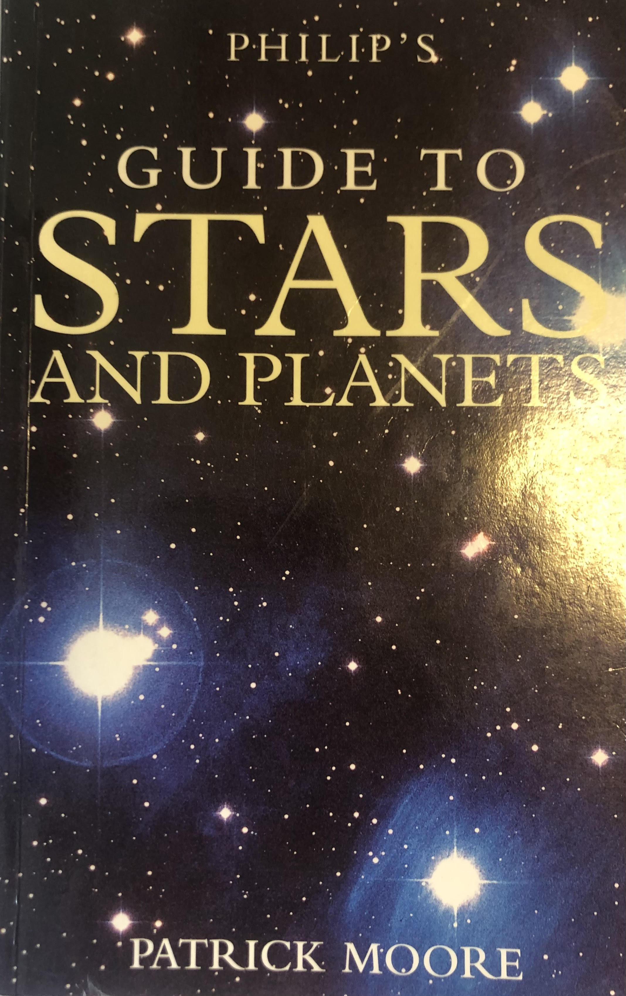
Philip’s Guide to Stars and Planets by Sir Patrick Moor is an informative scientific book on astronomy, covering aspects of the subject such as our solar system, the stars, galaxies and constellations with numerous maps of various astronomical systems. The cover features a full-page background image of a dark blue starry sky under white text stating the name and authorship. This choice in cover design immediately establishes the book’s status as non-fiction and scientific, providing a no-nonsense cover without flashy colours or overly pretentious fonts to catch the eye of browsers. That is not to say that the typeface lacks any personality of course; the all-caps, serifed letters provide a professional and sophisticated air that matches the formal, factual voice of the book.
The Signs

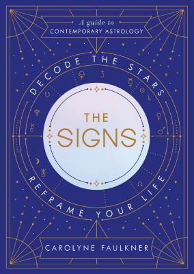
A first glance at the cover design of The Signs by Carolyne Faulkner instantly gives the impression that the book is more spiritual than scientific. The contrast of the geometric gold lines and stars against the navy blue background is reminiscent of a night sky while the gold design itself that encircles the book’s title mimics that of a birth or natal chart, particularly aided by the symbols for the different planets (not to be confused with the symbols for the star signs). The cover design for this book is much busier than Philip’s Guide to Stars and Planets but the geometricity of its layout avoids it from becoming overwhelming, instead providing a modern but mystical vibe.
Most of the capitalised text on The Signs’ front cover uses the font Century Gothic, while the italicised text is in Angsana New. The Century Gothic letters that curve around natal chart design are double spaced, and combined with the contrasting white against the navy background and the overall thin lined, structured composition of the font, it creates an easy to read and modern look that fits the overall brand of the book. Meanwhile the italicised state of the Angsana New allows the key phrases (e.g. the subtitle) to stand out as Century Gothic is a much bolder typeface.
The gold lettering of the title matches the gold imagery of the rest of the cover, while its central position in the middle of the page ensures the eye is drawn to it first and foremost. The typeface of the title is similar to the rest of the cover’s text except the spine of the S’s in ‘Signs’ is straight instead of curved, integrating the geometric design of the cover into a usually wholly curved letter while further differentiating the title from the rest of the text.
In conclusion, the overall choice in typeface and imagery for The Signs is much more intricate than that of Philip’s Guide to Stars and Planets, The variant fonts and colour choice complements the natal chart design in a way that provides an overall spiritual air that differs greatly with the to-the-point, simple and informative design of Philip’s Guide to Stars and Planets, clearly evidencing their difference in genres.
Find the Books on Goodreads:
Philip’s Guide to Stars and Planets - https://www.goodreads.com/book/show/6112199-guide-to-stars-and-planets
The Signs - https://www.goodreads.com/book/show/36700654-the-signs
